PROJECT INFORMATION
Graphic Name: What is the impact of building type and form on the different heat gains and losses for an extreme summer week?
Submitted by: Jeff Geisinger
Firm Name: NA
Other contributors or acknowledgements: NA
What tools did you use to create the graphic? EnergyPlus. Grasshopper ArchSim, Excel, Adobe InDesign
What kind of graphic is this? Donut Pie Charts
GRAPHIC INFORMATION
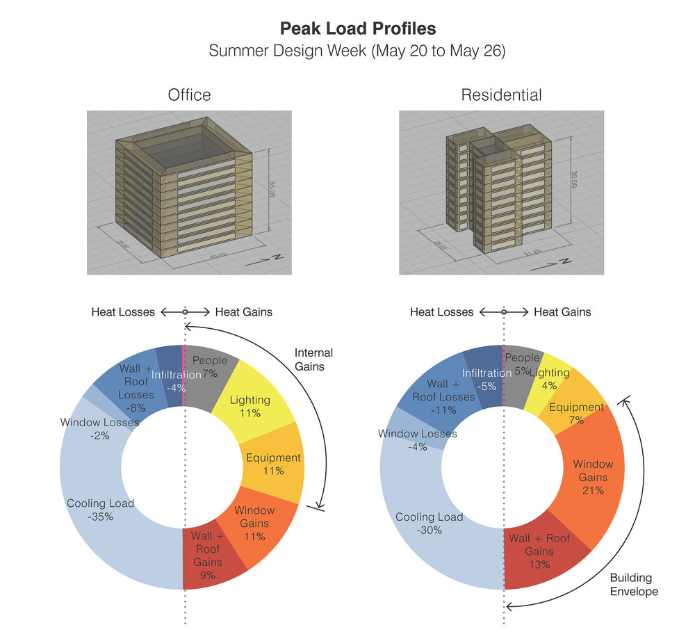
What are we looking at?
This graphic shows a breakdown of energy loads for two building types for an extreme summer week in the climate of San Luis Potosí, Mexico. The size of each segment of the donut chart represents the relative significance of a given energy load. Heat gains are represented in greys, reds, and yellows on the right of the chart, and heat losses are shown as shades of blue on the left of the chart.
How did you make the graphic?
I ran an energy simulation using Archsim on basic Rhino geometry. Using Excel, I processed the .csv output data into a donut chart using Excel, and assigned colors and fonts in that tool for the various energy load components. I further annotated the graphic in InDesign, and accompanied the chart with Rhino screenshots to make the relationship to base building geometry.
What specific investigation questions led to the production of this graphic?
I was interested in developing a visual way to communicate what energy conservation measures were the highest priority for a given building type in this climate.
How does this graphic fit into the larger design investigations and what did you learn from producing the graphic?
Because this was part of an environmental analysis for a large master plan project in a hot climate, the graphic was one of the earlier analysis to set the stage for subsequent energy studies, such as the effect of solar orientation and glazing ratios on cooling load.
What was successful and/or unique about the graphic in how it communicates information?
I think this one graphic successfully combines both the energy balance of a building (gains and losses equal on both sides of a graph) along with the relative sizes of different loads.
What would you have done differently with the graphic if you had more time/fee?
Sometimes it’s difficult to squeeze in text labels directly on top of graph elements, so I might try using a legend next time.