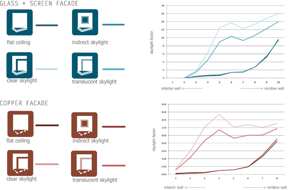
PROJECT INFORMATION
Graphic Name: What’s the impact of facade design on thermal comfort?
Submitted by: Andrew Corney
Firm Name: Sefaira
What tools did you use to create the graphic? Sefaira
What kind of graphic is this? Floor Plan Heat Map
GRAPHIC INFORMATION
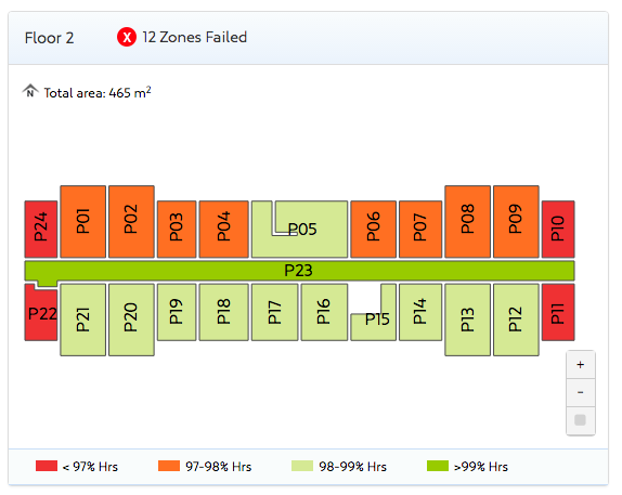
What are we looking at?
Provides a floor plan view of the building, coloured with information per zone describing whether they achieve a thermal comfort target.
The comfort target is shown in the criteria above. The user can quickly hone in on the zones that are failing one floor at a time.
By presenting the results in plan view, with the rooms shown, it presents results visually in a way that an audience familiar with the floor plate layout can process easily.
How did you make the graphic?
Sefaira makes these outputs automatically with any analysis run including thermal comfort.
What specific investigation questions led to the production of this graphic?
This graphic tries to help the designer understand “which zones are having the most trouble in my building” and then communicate that as needed to a wider team.
Traditionally consultants have to do this by:
- Declaring for themselves what they expect the worst zone to be based on experience
- Building thermal models of the zones that are declared as likely to be the worst
Relying on the trust between them on the design team to use that to steer design attention on those spaces.
This workflow is tedious and also in part risky, especially if the analyst is inexperienced and the reviewer is not privy to all the envelope details on a project.
The goal here is to help a designer hone in quickly on the spaces they should worry about first, while providing an easy way of proving that declaration to the rest of the design team.
How does this graphic fit into the larger design investigations and what did you learn from producing the graphic?
The graphic helps with facade design by identifying where thermal comfort goals are being missed. They should be incorporated into studies looking into peak loads, energy and daylight because all of these issues are affected by the envelope design.
The learning is that thermal comfort can be used as a design tool and that it can provide very helpful insight into how successfully a design is working.
What was successful and/or unique about the graphic in how it communicates information?
Thermal comfort analysis is typically time consuming and hard. It therefore requires a lot of preparation before analysis can be useful.
This graphic is helpful because it makes it really easy to see which spaces are struggling to meet the thermal comfort goals. It reduces the effort needed to hone in on the key spaces requiring attention and serves to prove visually the design team that those spaces are worse.
What would you have done differently with the graphic if you had more time/fee?
We ended up adding a gradient option to this graphic. The reason was so that people could identify which zones were just failing vs those that were the worst on the floor plate.
We’re interested in exploring how to convert this graphic into a comparative analysis, where a project has a series of design options and wants to compare PMV for the worst zone against those options and somehow communicate it on the floor plan.